Money branches and flows like a river system—starting from a single source and splitting into countless streams. A Sankey diagram captures this beautifully, transforming your spending data into an intuitive visual story that spreadsheets simply can't tell.
What is a Sankey Diagram?
A Sankey diagram is a flow visualisation where the width of each arrow represents the size of the value it carries. Originally developed by Irish engineer Matthew Sankey in 1898 to show energy efficiency in steam engines, these diagrams have become invaluable for visualising any kind of flow—including how your expenses break down across categories.
Why Sankey Diagrams Work for Personal Finance
Traditional pie charts show you what you spent money on, but they treat each category as an isolated slice. Sankey diagrams show the flow—how your total spending branches out into major categories, then subdivides further into subcategories.
The visual impact is immediate: thick bands represent major expenses, while thin streams highlight smaller spending. There's no hiding from a particularly wide "Dining Out" band when it's staring back at you.
Reading Your Expense Flow
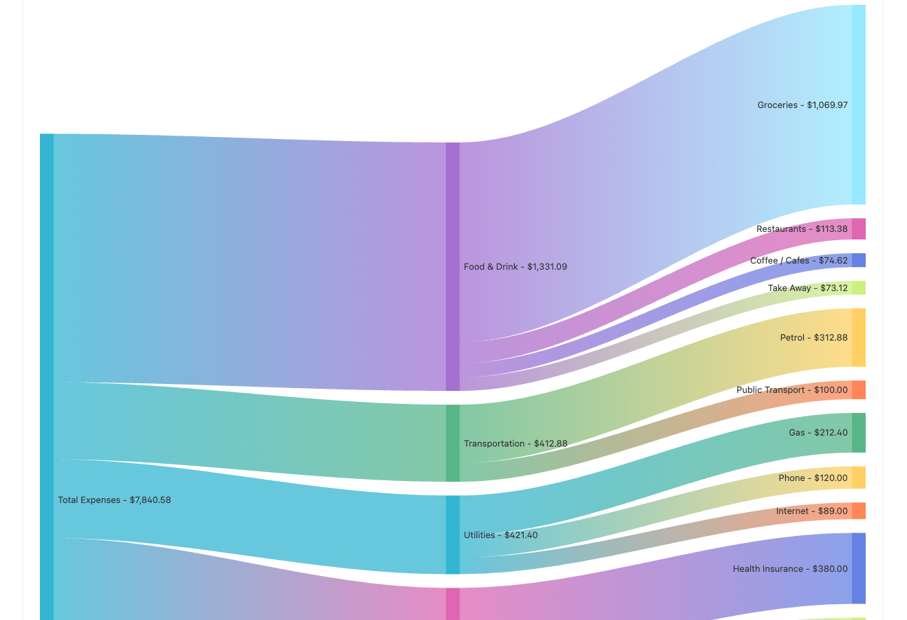
A typical expense Sankey flows from left to right:
Left side: Total expenses
Your complete spending for the period, shown as a single wide band.
Centre: Top-level categories
- Housing
- Transportation
- Food & Drink
- Utilities
- Entertainment
Right side: Subcategories
- Food & Drink → Groceries, Restaurants, Coffee, Alcohol
- Transportation → Fuel, Public Transport, Car Maintenance
- Entertainment → Streaming, Hobbies, Concerts
Viewing Your Income Flow
Switch to income view and you'll see your various income streams and how they break down:
Left side: Total income
Your complete earnings for the period.
Right side: Income sources
- Salary/Wages
- Interest
- Dividends
- Government Assistance
- Other Income
This view helps you understand the composition of your income—whether you're relying on a single source or have diversified streams.
What Your Diagram Reveals
The Big Picture at a Glance
When you first look at your expense Sankey, the thickest bands immediately tell you where your money is really going. Many people are surprised to discover that their "small" daily coffee habit creates a band nearly as wide as their utilities.
Hidden Patterns
Sankey diagrams excel at revealing patterns you might otherwise miss:
- Category dominance — Is housing consuming half your total spending?
- Subcategory surprises — Within Food & Drink, is dining out larger than groceries?
- The long tail — Are dozens of small subcategories collectively adding up to a significant amount?
Creating Meaningful Categories
The power of your Sankey diagram depends entirely on how you categorise your transactions. Too few categories and you lose insight; too many and the diagram becomes cluttered.
The hierarchical flow works best with:
- 8-12 top-level categories branching from your total
- 3-6 subcategories within each, where relevant
For example, "Food & Drink" branches cleanly into Groceries, Restaurants, Coffee, and Alcohol—enough detail to be useful without overwhelming the visualisation.
Tracking Changes Over Time
A single Sankey diagram is insightful, but comparing diagrams across different time periods is transformative. You might create:
- Monthly comparisons — How did December's holiday spending differ from November?
- Quarterly views — Are you trending in the right direction?
- Year-over-year — How has your expense breakdown evolved?
Watch how the bands shift and resize—perhaps your Entertainment branch has been steadily growing while Savings shrinks.
Taking Action on What You See
A Sankey diagram isn't just pretty—it's a decision-making tool. Here's how to use yours:
- Identify the thickest branches — Are these aligned with your values and priorities?
- Look for surprising flows — Any categories wider than expected?
- Examine subcategory splits — Where within a category is the money actually going?
- Spot opportunities — Which branches could realistically be trimmed?
The goal isn't to eliminate all spending—it's to ensure your money flows where you actually want it to go.
Tips for Better Visualisations
- Be consistent with categorisation — The same type of purchase should always go to the same category
- Use meaningful time periods — Monthly views work well for most people
- Toggle between views — Check both your income and expense Sankeys for the complete picture
- Review regularly — Make it a monthly ritual to generate and review your diagrams
Conclusion
Your finances tell a story, and a Sankey diagram is one of the most powerful ways to read it. By visualising how your spending branches across categories—or how your income breaks down by source—you gain insights that numbers alone can't provide.
Start tracking your transactions with proper categorisation today, and watch your financial story unfold in a whole new way.
Ready to see your spending as a Sankey diagram? Head to the Reports section in Financio and toggle between Income and Expenses to explore your financial flow.